As a web designer I always put user first. The easiest, fastest, most intuitive way of achieving a goal is my first priority.
Now when there is around billion websites (based on internet live stats ) any user looking for any product on the internet has a choice.
If your website is not on first page of Google, it’s slow, not intuitive, doesn’t work on mobile devices or doesn’t seem legit, user will close your website in less than 4s and never come back.
My concept of getting more sales is very simple:
- Simple and intuitive design
- Be trustworthy
- Show most important point of sale
- Responsive is a must
1. Get a simple, intuitive design
If its a add to cart / checkout, getting information, submitting forms, etc are buried under 30 different actions, I can bet you that your conversion rate is as low as snow levels in Perth, Australia.
To boost your conversion rate: Simplify the user journey. Think about your website, what is its purpose, what are you selling and how to make users experience better. Boost contrast on your add to cart buttons or any other actions you want user to see first.
Remember one important thing: you are not your standard user. What works for you might and probably wont work for them 🙂
2. Be trustworthy
Don’t be anonymous: show your physical location, your contact details, company details, etc.
Show that your website is safe: Get SSL certificate, show that your site is encrypted and safe, show any debit or credit card vendor logos.
3. Show most important point of sale
Show important info: Let user know that you will ship items next day, that there is a warranty and you will take the item back if he will change his mind. Those are basics covered by the consumer law anyways, but assuring user that you respect it and they can get it without a hassle is very important.
4. Responsive
Yes, go responsive! As mobile are almost exceeding desktop users you cannot ignore them any more. In web industry responsive is not even point of sale anymore – it is a standard that we all improve. Most of your users are using desktop computers only at work. If they are at home or on the run its their phone they are using. Make sure that your website looks and works on mobile!
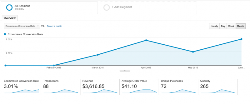
Take a look at the photo below which is a screen shot of Google Analytics for a e-commerce website I have improved around March 2015. From January until March there was no sales. After that you can see a steady spike in sales. I have just improved the design and general user experience.
Sales came naturally. No marketing, no SEO. Traffic was already there but there was no conversion.
As simple as it all sounds sometimes it is not that simple to execute but with help of professional UI / UX specialist you will make things better. If you need a hand with boosting your conversion ping me an email.
Thanks!
Daniel

